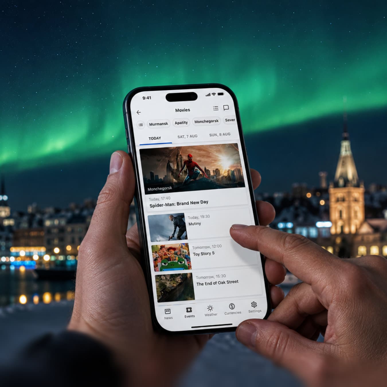
media
Putting a region in your pocket: restructuring the Hibiny regional portal app
Rebuilt the mobile app for one of the Arctic's largest regional portals — from a shrunken copy of a desktop site into a focused, four-section product people actually keep installed.
- Role
- Senior Product Designer
- Company
- Hibiny.com
- Daily portal audience
- ~1.5M
Product
Hibiny.com is the main information platform of the Murmansk region, above the polar circle. For most people living there it is not "a news site": it is where you check what happened overnight, find a job, sell a car, rent a flat, see what's playing at the cinema, and look up a phone number. A news outlet and a regional classifieds platform in one product.
Challenge
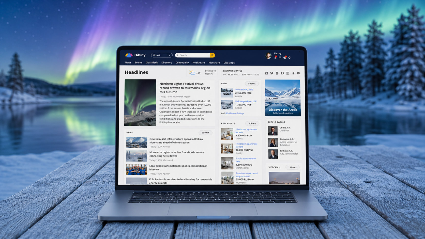
The app already existed, but hardly anyone used it. The problem wasn’t with the visual design. The app tried to be a full-fledged portal: dozens of sections, a navigation model designed for desktop computers, all squeezed onto a 5-inch screen. Not exactly what someone standing at a bus stop in February needs on their phone.

Process
Deciding what the app is not
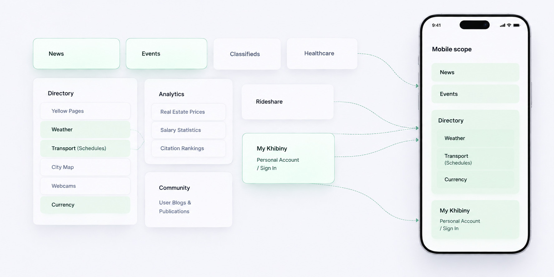
The first deliverable wasn't a screen — it was a scope. I went through the portal's sections and separated the ones with genuine mobile intent (short, frequent, checked-on-the-go) from the ones that belong to a desk and a large screen.
A navigation model that fits a thumb
With the scope settled, the structure followed: a flat, shallow hierarchy with a small number of persistent top-level entries, and everything else reachable in one or two taps from a feed. No nested menus, no hidden gestures carrying primary actions.
Designing for two platforms without designing twice
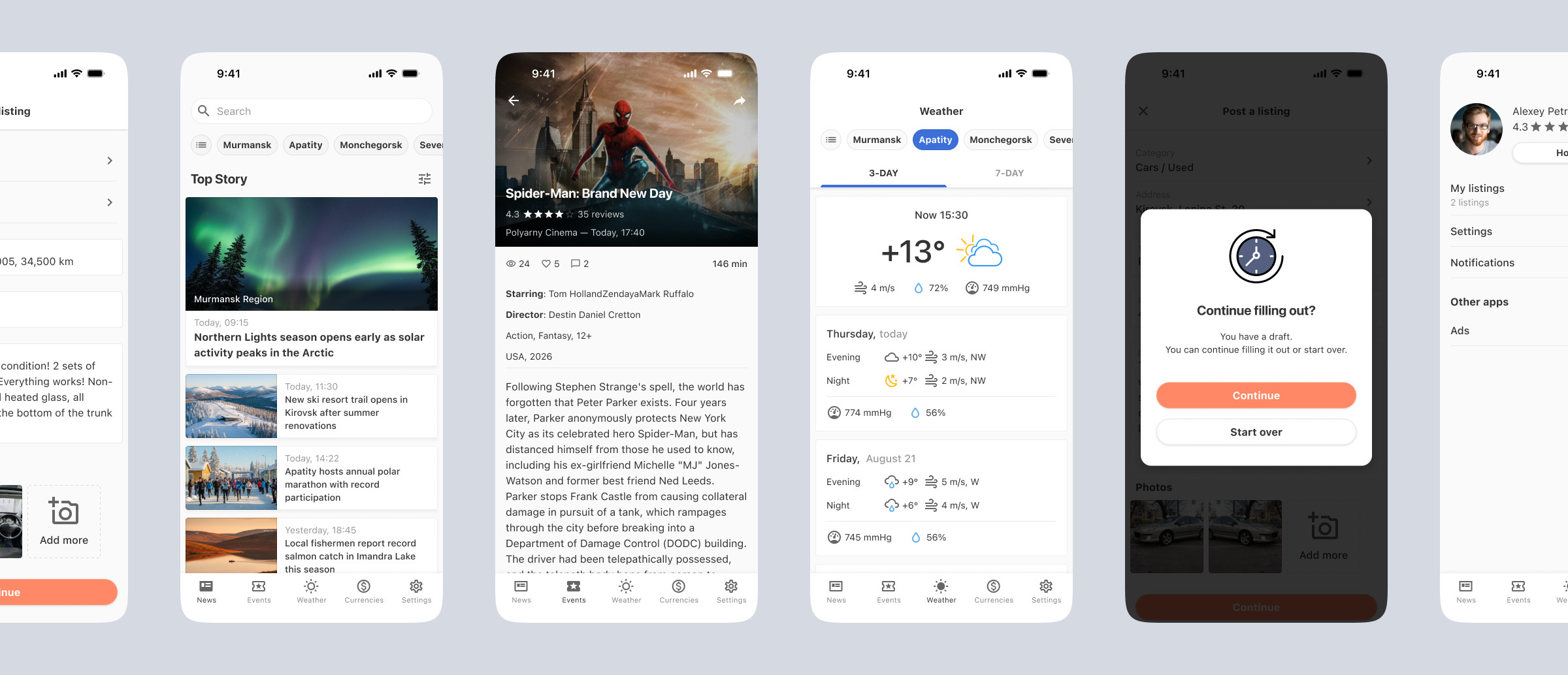
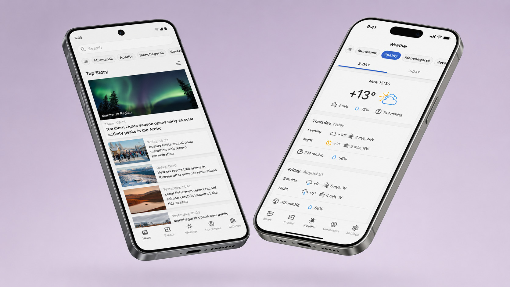
The app shipped on iOS and Android. Rather than drawing two parallel sets of screens, I built one component set with platform-specific behaviour where it mattered: navigation patterns, system controls, back behaviour. And shared everything else: type scale, spacing, card structure, states.
Outcomes
The app was released on both platforms and quickly became the number one regional news app, serving a population of around 650,000. Since then, the portal itself has continued to grow, and its model has been replicated for other regions.