
fintech
Placings: redesigning wealth management as a conversation with an AI-expert
Started as a UI cleanup. Became a full product rethink: a rebuilt design system, a new information architecture, and a conversational AI interface that acts as a personal financial advisor rather than a dashboard.
- Role
- Principal Product Designer
- Company
- Placings
The product
Placings is a wealth management platform built on a different premise than its competitors. Tools like Vyzer and Kubera are designed by finance experts for finance experts. They're powerful, but they reward users who already know what they're looking for.
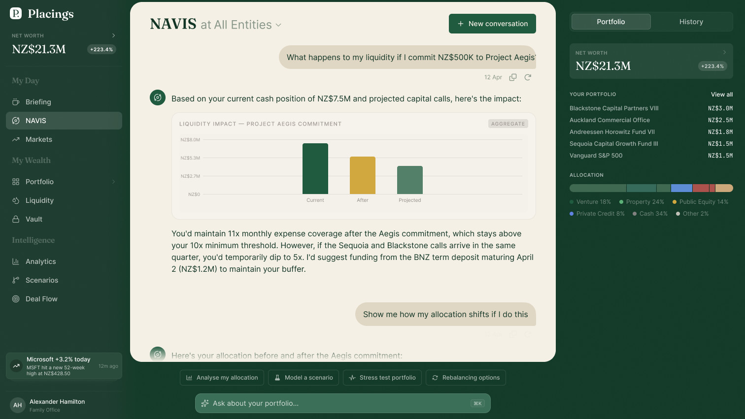
Placings is designed for a different investor: someone who wants to grow and manage their portfolio intelligently, without becoming a full-time analyst. The product's answer to that challenge is deeply integrated AI. Not a chatbot bolted onto an existing dashboard, but a first-class interface capable of surfacing insights, answering questions, and taking action on a user's portfolio through natural conversation.
The starting point
The product was born through rapid prototyping in Replit (an AI-assisted vibe-coding environment) before a developer was brought in to build it properly. This is an increasingly common origin story for early-stage products: prove the concept fast, then build it right.
The challenge is that vibe-coded prototypes don't produce design specs. By the time I joined, the developer had built a functional production application using the Replit prototype as the only visual reference. Without a shared design language, every new screen required judgment calls. Duplicate component implementations had accumulated. Style tokens were inconsistent. Nothing in the codebase described why things looked the way they did.
My original scope was to clean up the inconsistencies. When I looked at what existed, it was clear the right move wasn't cleanup. It was reconstruction.
Auditing the system
The only design documentation was the code itself. So I treated it like a research artifact.
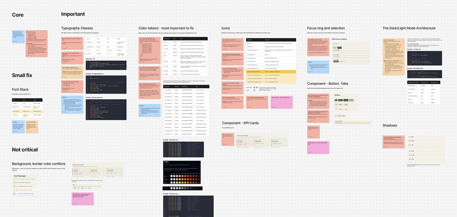
Using AI tooling, I ran a systematic code audit: a structural overview of the project (component library organization, style definitions, token setup) and a health check (duplicate components, token conflicts, style drift). The audit surfaced roughly what I expected, a system that had grown organically without a guiding architecture, but it also mapped exactly where the inconsistencies lived.
From this, I built an AI-ready project knowledge base: a structured document capturing the full system, every component, token, and pattern, with conflict annotations and open questions.
Reconstructing the design system in Figma
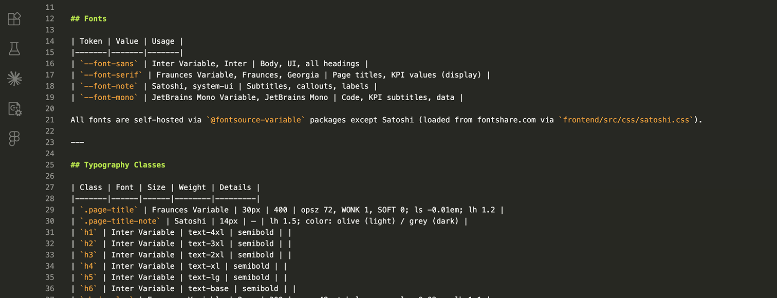
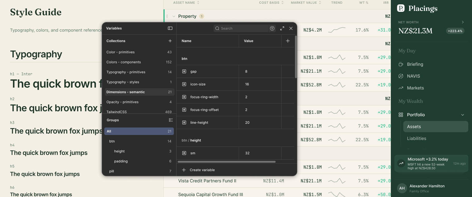
With the full system mapped, I used the Figma MCP server to reconstruct the design system directly from the codebase: design tokens, component library, and iconography. All of it derived from what was in production, not invented in parallel.
The result was a Figma library synchronized with the code from day one. Before a single new screen was designed, both sides of the project had a shared source of truth they could trust.
UX strategy
With the foundation established, I conducted a full UX audit covering navigation, information architecture, forms, data tables, interaction patterns, and core user flows. The scope covered both the production app and the original prototypes, combined with a detailed competitive analysis.
The competitive analysis clarified the opportunity. Vyzer and Kubera are sophisticated tools that assume users want to navigate complexity. They succeed at what they do. But they leave a gap: the investor who wants informed decisions without the learning curve. That gap is what Placings is built to fill, and the AI integration is what makes it credible.
The AI-native proposal
The original product plan included an AI assistant as a dedicated panel: a section where users could ask portfolio questions. I pushed to take the concept further.
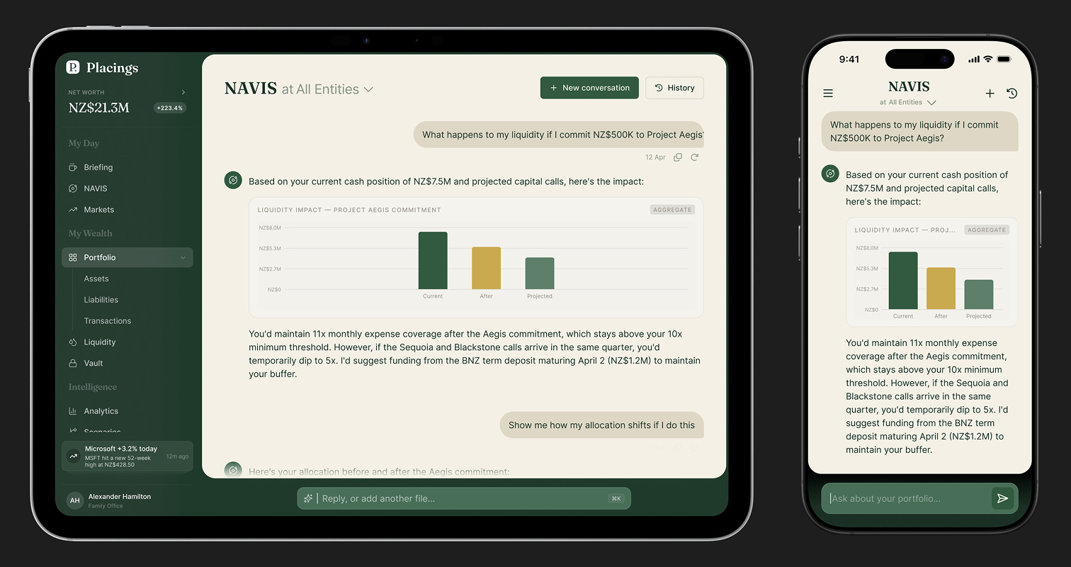
What if the AI weren't a feature you opened, but the primary way you interacted with your portfolio?
This is where the industry is heading. A2UI, a framework introduced by Google in 2025, defines how AI agents can generate adaptive, context-aware interfaces in real time, rendering the right UI for each interaction rather than forcing users through a fixed information architecture. The key insight: the interface should respond to the conversation, not the other way around.
For Placings, this meant designing the AI as a genuine financial advisor with the ability to:
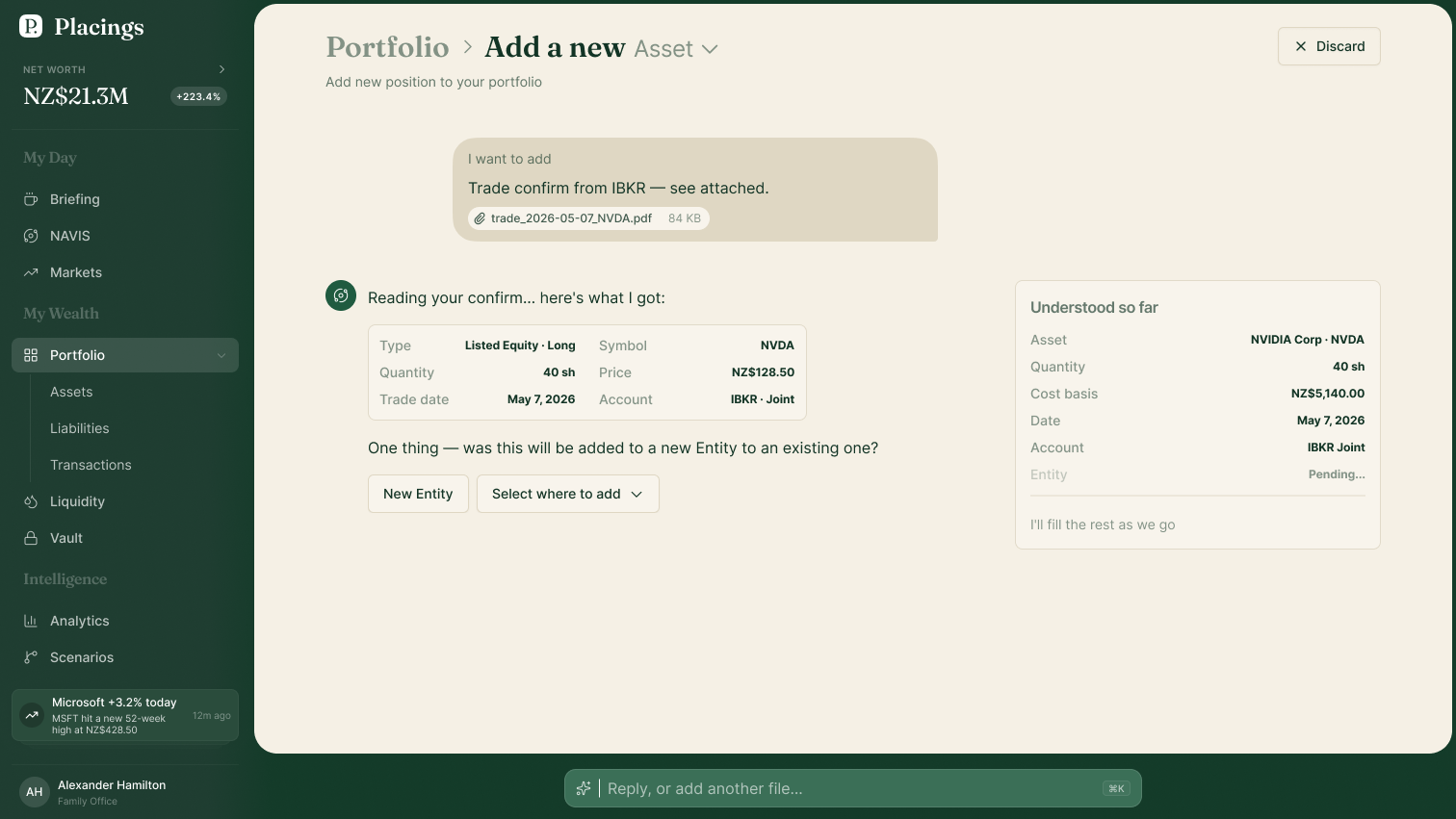
- Answer questions and surface insights, with charts and tables rendered inline as needed
- Execute portfolio actions directly: buying, selling, adjusting positions
- Navigate the application on behalf of the user when that's faster than doing it manually
The traditional dashboard view remains for users who prefer direct control. But the AI conversation becomes a first-class entry point, and the interface adapts to meet the user where they are.
One practical consequence: the product had separate search and AI input fields. Because the AI handles both navigation and portfolio queries, they were unified into a single entry point, simplifying the interface without removing capability.
Designing the product
With direction validated through low-fidelity wireframes, I moved into component and screen design.
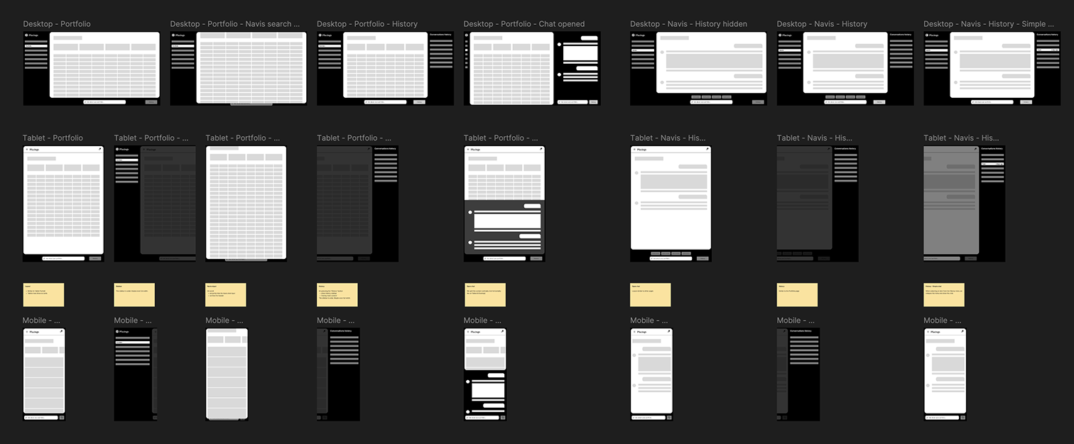
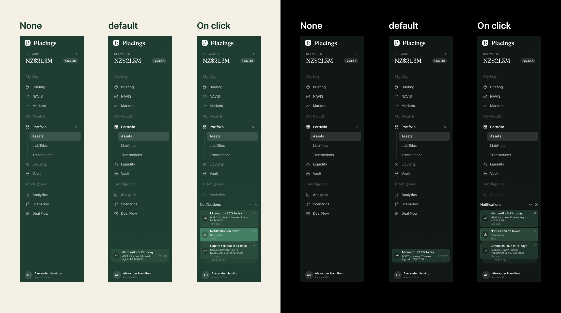
The full interface was redesigned: KPI cards, data tables, navigation, forms, and detail views. All rebuilt with consistent specifications, documented interaction states, and defined behavioral logic. Reusable screen templates were created to give the developer a reliable starting point for new surfaces.
Mobile wasn't designed as a reduced version of desktop. It was designed in parallel, from its own constraints. Dark mode was built alongside light from the start, with a dedicated semantic token set so both themes share the same component layer without duplication.
The micro-interaction layer (loading states, transitions, contextual empty states, system feedback) was designed to make the product feel considered rather than assembled. When the AI is generating a response, the interface responds. When the portfolio has no data yet, the empty state teaches rather than just reports.
Status
Placings is in active development. The design system is in production, core screens are shipped, and the AI-native interaction model is being refined as the product's feature set grows.
The workflow itself is worth naming: AI-assisted code audits, MCP-based design system construction, structured knowledge bases that keep AI-assisted work accurate across long engagements. These aren't experiments anymore. They're reliable tools. This project was an opportunity to apply them at full depth, on a product that genuinely needed what they offer.